A love letter to data science tooling

I spend a lot of time installing and testing libraries, and I wanted to share some that spark joy.
In no particular order:
Polars

I absolutely love pandas, but there is space for more than one python-data-manipulation focused bear in my heart, and when I need speed, Polars is where I turn to.
I recently wrote another story here on speeding up some Pandas code, but even after all the optimizations, Polars was still 10–20x faster!
When I ported some of my codebase to Polars I typicaly saw a 50–150x speedup. Well worth it on anything that takes more than a few minutes! It even allowed me to run some fairly intensive data manipulations inside an interactive streamlit app (without caching!).
The syntax is fairly clean, and I can wholeheartedly say Polars is a must have tool if you care for type-safe, fast, muti-threaded code.
https://pola-rs.github.io/polars/py-polars/html/reference/
DBT (Data Build Tool)
It’s impressive how quickly this tool went from zero to critical dependency. Perhaps the only drawback is that it’s fairly hard to explain what is DBT

A few explanations I’ve come across are:
- Every hacky tool you’ve ever built to manage SQL, but it just works!
- Like Terraform for relational databases.
For me, DBT is a great way to manage the complexity in my data warehouse. It allows me to declaratively build, test, debug and refactor my database tables.
Moreover, a lot of my time is spent in DBT’s autogenerated documentation — especially the DAG
Here each node is a table or a view, and DBT tracks what tables depend on other tables. It can also use this to update the data in the right order.
The DAG can get pretty large, but DBT has good filtering options to focus on the parents (or children) of a given table.
To clarify, DBT is NOT A DATABASE — it merely compiles and runs SQL against whichever other tool you are using (SQL Server, Postgres, MariaDB, Databricks, Snowflake, BigQuery, …).
It’s easy to get started. I recommend giving DBT a try!
Pendulum
Hey, small things can be nice. Pendululum makes it slightly easier to work with datetitmes.
For example:
import pendulum
now = pendulum.now()print(now.to_atom_string())
print(now.to_cookie_string())
print(now.to_date_string())
print(now.to_datetime_string())
print(now.to_iso8601_string())
print(now.to_rfc1036_string())
results in
'2022-03-01T12:04:33+00:00'
'Tuesday, 01-Mar-2022 12:04:33 GMT'
'2022-03-01'
'2022-03-01 12:04:33'
'2022-03-01T12:04:33.980187+00:00'
'Tue, 01 Mar 22 12:04:33 +0000'
which is nice :)
There is a lot more functionality of course, some favourites:
# Compares the datetime value stored in "now" with the current time
now.diff_for_humans()
>>> '6 minutes ago'# Change timezones
now.in_tz('Japan').to_cookie_string()
>>> 'Tuesday, 01-Mar-2022 21:06:19 JST'# Get the last day of the month of the date object
now.end_of('month').to_cookie_string()
>>> 'Thursday, 31-Mar-2022 23:59:59 BST'
https://github.com/sdispater/pendulum
Optuna
I guess this is as good as black box optimization gets. It’s basically a Bayesian Hyper Search — but one that has a very elegant API.
It’s so nice in fact, that it’s tempting to use it “quick” optimizations.
Do you want to find the minimum of
(x-7)**4 + (y+3)**2 + 10*(x+y)**2
This will run in ~1 second:
import optunadef foo(x,y):
    return (x-7)**4 + (y+3)**2 + 10*(x+y)**2def objective(trial):
    x = trial.suggest_float('x', low=-10, high=10)
    y = trial.suggest_float('y', low=-10, high=10)

    score = foo(x,y)
    return scorestudy = optuna.create_study(direction='minimize')
study.optimize(objective, n_trials=100)study.best_trial
>>> FrozenTrial(number=73, values=[10.98249583588483], datetime_start=datetime.datetime(2022, 3, 1, 12, 24, 31, 239827), datetime_complete=datetime.datetime(2022, 3, 1, 12, 24, 31, 244810), params={'x': 6.371872033442777, 'y': -6.276590343209744}, distributions={'x': UniformDistribution(high=10.0, low=-10.0), 'y': UniformDistribution(high=10.0, low=-10.0)}, user_attrs={}, system_attrs={}, intermediate_values={}, trial_id=73, state=TrialState.COMPLETE, value=None)
ie.
- x = 6.371872033442777
- y = -6.276590343209744
I think this visualization makes it clear what is happening
optuna.visualization.plot_contour(study, ['x','y'])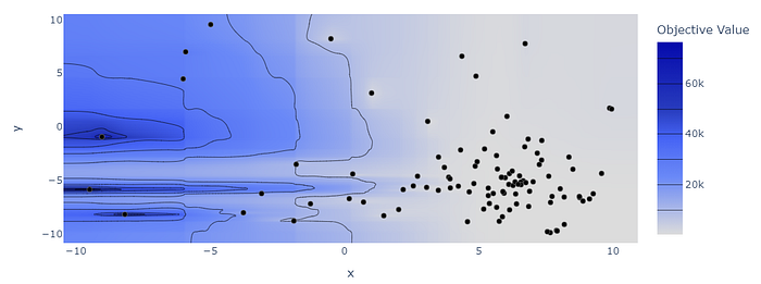
Looks like the optimizer has figured out where to spend most of the time searching. And it found a reasonably good approximation.
That said, THIS IS NOT WHAT OPTUNA IS FOR. Optuna makes more sense where each trial is reasonably expensive (eg. fitting a model), and where exhaustively searching the parameter space would be intractable.
Diagrams
Well, this is just cool
From the documentation:
from diagrams import Cluster, Diagram
from diagrams.gcp.analytics import BigQuery, Dataflow, PubSub
from diagrams.gcp.compute import AppEngine, Functions
from diagrams.gcp.database import BigTable
from diagrams.gcp.iot import IotCore
from diagrams.gcp.storage import GCSwith Diagram("Message Collecting", show=False):
    pubsub = PubSub("pubsub")with Cluster("Source of Data"):
        [IotCore("core1"),
         IotCore("core2"),
         IotCore("core3")] >> pubsubwith Cluster("Targets"):
        with Cluster("Data Flow"):
            flow = Dataflow("data flow")with Cluster("Data Lake"):
            flow >> [BigQuery("bq"),
                     GCS("storage")]with Cluster("Event Driven"):
            with Cluster("Processing"):
                flow >> AppEngine("engine") >> BigTable("bigtable")with Cluster("Serverless"):
                flow >> Functions("func") >> AppEngine("appengine")pubsub >> flow
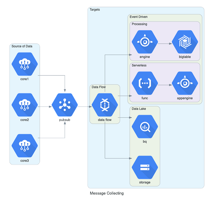
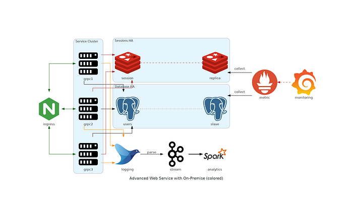
This also works for AWS, Azure, On-Prem, etc… It also supports custom logos. For another illustration:
with Diagram(name="Advanced Web Service with On-Premise (colored)", show=False):
    ingress = Nginx("ingress")metrics = Prometheus("metric")
    metrics << Edge(color="firebrick", style="dashed") << Grafana("monitoring")with Cluster("Service Cluster"):
        grpcsvc = [
            Server("grpc1"),
            Server("grpc2"),
            Server("grpc3")]with Cluster("Sessions HA"):
        primary = Redis("session")
        primary - Edge(color="brown", style="dashed") - Redis("replica") << Edge(label="collect") << metrics
        grpcsvc >> Edge(color="brown") >> primarywith Cluster("Database HA"):
        primary = PostgreSQL("users")
        primary - Edge(color="brown", style="dotted") - PostgreSQL("replica") << Edge(label="collect") << metrics
        grpcsvc >> Edge(color="black") >> primaryaggregator = Fluentd("logging")
    aggregator >> Edge(label="parse") >> Kafka("stream") >> Edge(color="black", style="bold") >> Spark("analytics")ingress >> Edge(color="darkgreen") << grpcsvc >> Edge(color="darkorange") >> aggregator
Pomegranate
I’ve been recently re-watching some talks by Vincent Warmerdam, and his showcase here of Pomegranate (a library for computing conditional probabilities) caught my attention.
To exemplify one of its capabilities I’ll use this example from their documentation which itself showcases how pomegranate addresses Bayes nets such as Lauritzen&Spiegelhalter88.
Suppose we have 7 dimensions of possible information about people:
- Did they visit Asia
- Do they smoke
- Do they have tuberculosis
- Do they have lung cancer
- Do they have bronchitis
- Do they have shortness of breath
- Have they had an x-ray
Also, regarding the population we have:
- Joint distribution of having tuberculosis & having been to Asia.
- Joint distribution of having lung cancer & smoking.
- Joint distribution of having bronchitis & smoking.
- The joint distribution of having x-ray & having lung cancer or tuberculosis.
- The joint distribution of having shortness of breath & having lung cancer or tuberculosis or bronchitis.
Given the above we can make this network:
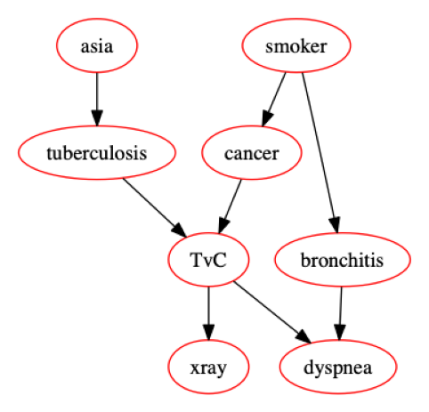
And we can then say:
GIVEN someone has tuberculosis, bronchitis, and is not a smoker, THEN there is a 88% chance they’ll have an x-ray, a 96% chance they’ll have shortness of breath, a 2% chance of lung cancer, and a 95% chance of having visited Asia.
The code of the above is 90% typing in the conditional probabilities. Here is a copy, but you can find the original here.
%pylab inline
%config InlineBackend.figure_format='retina'from pomegranate import *asia = DiscreteDistribution({'True':0.5, 'False':0.5})

tuberculosis = ConditionalProbabilityTable(
    [[ 'True', 'True', 0.2 ],
     [ 'True', 'False', 0.8 ],
     [ 'False', 'True', 0.01 ],
     [ 'False', 'False', 0.99 ]], [asia])smoking = DiscreteDistribution({'True':0.5, 'False':0.5})

lung = ConditionalProbabilityTable(
    [[ 'True', 'True', 0.75 ],
     [ 'True', 'False', 0.25 ],
     [ 'False', 'True', 0.02 ],
     [ 'False', 'False', 0.98 ]], [smoking])

bronchitis = ConditionalProbabilityTable(
    [[ 'True', 'True', 0.92 ],
     [ 'True', 'False', 0.08 ],
     [ 'False', 'True', 0.03 ],
     [ 'False', 'False', 0.97 ]], [smoking])

tuberculosis_or_cancer = ConditionalProbabilityTable(
    [[ 'True', 'True', 'True', 1.0 ],
     [ 'True', 'True', 'False', 0.0 ],
     [ 'True', 'False', 'True', 1.0 ],
     [ 'True', 'False', 'False', 0.0 ],
     [ 'False', 'True', 'True', 1.0 ],
     [ 'False', 'True', 'False', 0.0 ],
     [ 'False', 'False', 'True', 0.0 ],
     [ 'False', 'False', 'False', 1.0 ]], [tuberculosis, lung])xray = ConditionalProbabilityTable(
    [[ 'True', 'True', 0.885 ],
     [ 'True', 'False', 0.115 ],
     [ 'False', 'True', 0.04 ],
     [ 'False', 'False', 0.96 ]], [tuberculosis_or_cancer])dyspnea = ConditionalProbabilityTable(
    [[ 'True', 'True', 'True', 0.96 ],
     [ 'True', 'True', 'False', 0.04 ],
     [ 'True', 'False', 'True', 0.89 ],
     [ 'True', 'False', 'False', 0.11 ],
     [ 'False', 'True', 'True', 0.96 ],
     [ 'False', 'True', 'False', 0.04 ],
     [ 'False', 'False', 'True', 0.89 ],
     [ 'False', 'False', 'False', 0.11 ]], [tuberculosis_or_cancer, bronchitis])s0 = State(asia, name="asia")
s1 = State(tuberculosis, name="tuberculosis")
s2 = State(smoking, name="smoker")
s3 = State(lung, name="cancer")
s4 = State(bronchitis, name="bronchitis")
s5 = State(tuberculosis_or_cancer, name="TvC")
s6 = State(xray, name="xray")
s7 = State(dyspnea, name='dyspnea')network = BayesianNetwork("asia")
network.add_nodes(s0, s1, s2, s3, s4, s5, s6, s7)network.add_edge(s0, s1)
network.add_edge(s1, s5)
network.add_edge(s2, s3)
network.add_edge(s2, s4)
network.add_edge(s3, s5)
network.add_edge(s5, s6)
network.add_edge(s5, s7)
network.add_edge(s4, s7)network.bake()# If you want the plot:
network.plot()
observations = {'tuberculosis': 'True',
                'smoker': 'False',
                'bronchitis': 'True'}beliefs = network.predict_proba(observations)
results = {state.name: belief for state, belief in zip(network.states, beliefs)}
The output is then the deduced probability of all the unobserved states.
{'asia': {
     "class" :"Distribution",
     "dtype" :"str",
     "name" :"DiscreteDistribution",
     "parameters" :[
         {
             "True" :0.9523809523809521,
             "False" :0.04761904761904782
         }
     ],
     "frozen" :false
 },
 'tuberculosis': 'True',
 'smoker': 'False',
 'cancer': {
     "class" :"Distribution",
     "dtype" :"str",
     "name" :"DiscreteDistribution",
     "parameters" :[
         {
             "False" :0.9799999999999995,
             "True" :0.020000000000000438
         }
     ],
     "frozen" :false
 },
 'bronchitis': 'True',
 'TvC': {
     "class" :"Distribution",
     "dtype" :"str",
     "name" :"DiscreteDistribution",
     "parameters" :[
         {
             "False" :0.0,
             "True" :1.0
         }
     ],
     "frozen" :false
 },
 'xray': {
     "class" :"Distribution",
     "dtype" :"str",
     "name" :"DiscreteDistribution",
     "parameters" :[
         {
             "False" :0.11500000000000017,
             "True" :0.8849999999999999
         }
     ],
     "frozen" :false
 },
 'dyspnea': {
     "class" :"Distribution",
     "dtype" :"str",
     "name" :"DiscreteDistribution",
     "parameters" :[
         {
             "False" :0.040000000000000216,
             "True" :0.9599999999999997
         }
     ],
     "frozen" :false
 }}
Who knew math could be so much fun!
EmbeddingHub
I’ve probably hacked together this functionality half a dozen times before being introduced to this library (by my sister no less).
If you need to use embeddings, or do a nearest neighbour search among them, or build access control, versioning, caching… this definitely looks like the way forward.
I’ve not used yet, but I look forward to it. The
https://github.com/featureform/embeddinghub
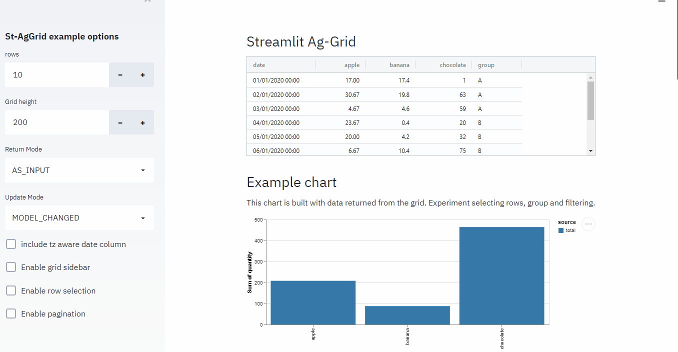
AG Grid, Streamlit-AGGrid, and IPyaggrid
You’d think that with how important tabular data is in the data science world, better tools would exist to present, explore, and showcase tables. Turns out there is a fantastic tool for this: AG Grid.
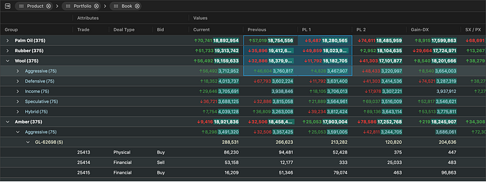
The example above is from the AG Grid main website, but I think this one showcases it better via ipyaggrid:
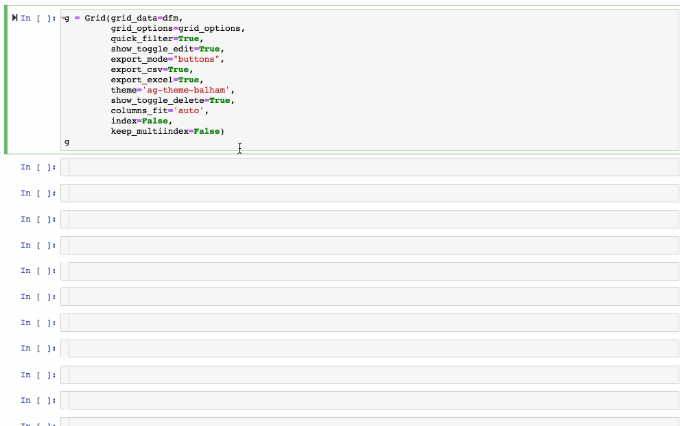
It also has a very strong synergy with Streamlit via streamlit-aggrid, since it allows for cell selection, filtering, in-cell tickboxes, etc… it really is as flexible as I can imagine.
The fly in the ointment is that it is primarily a javascript asset and you have to pay a licence fee if you want to unlock its full potential.
https://github.com/PablocFonseca/streamlit-aggrid
https://dgothrek.gitlab.io/ipyaggrid/
Facets
If ever there was a visualization to rule them all, I think Facets has a good claim to that title.
Facets allow you to visualize data in up to 6 dimensions! And it does so in an incredibly intuitive and easy-to-use style. It also exports to HTML for interactive review.
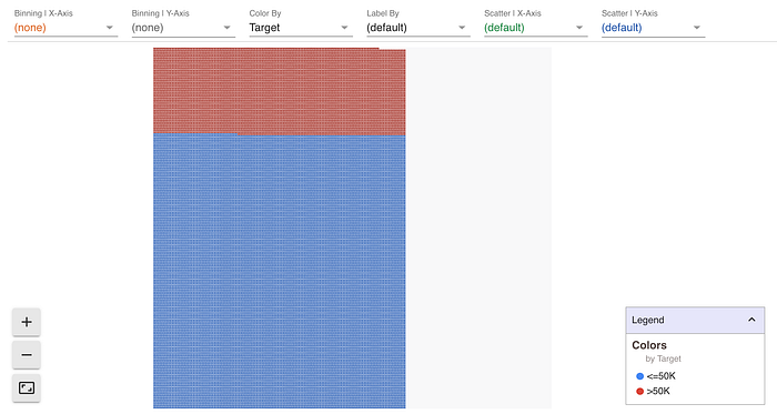
To exemplify, we can look to understand a sample of US census data, with a view of looking at how salaries above $50,000 fall among the general population.
We can start by looking at fraction of salaries above $50k across the whole population.
Next, we can look at this by Sex.

Note that the visualization tells you the fraction (as could a Pie-chart) but also the volume of people in each category! And we can continue this across a second dimension (e.g. Race).
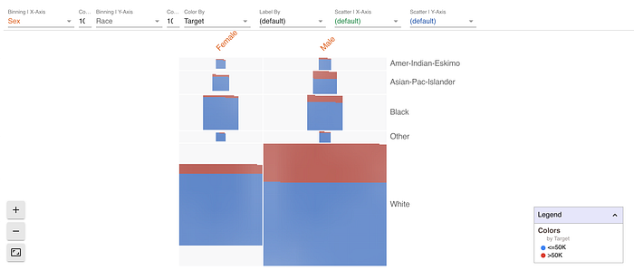
Already it’s quite clear that the majority of our affluent individuals are within the white males, both as a proportion and in absolute numbers.
But we may next be interested in how this splits by non-categorical factors.
If we offset the points according to age, it looks like there is a clear pattern here, with those earning >50k being almost exclusively older. At least older than 18yo.
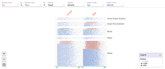
And just to rack up the score, we can offset the dots in the y-axis by yet another quantity. Here we can do it by hours worked per week, and we see a few interesting patterns:
- People work longer hours when between 20 and 60
- Most male top earners work 40+ hours a week. The pattern for women is less clear

Lastly, you can label each of these dots with yet another variable. Here we can look at education.
And you can “click” on a dot to get the full information behind that individual.
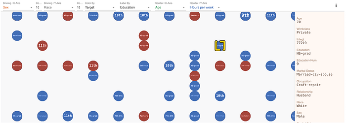
As far as information density goes, this is fairly good!
If you want to play with this, here is the code:
#!pip install facets-overviewimport pandas as pdfrom IPython.core.display import display, HTML
from facets_overview.generic_feature_statistics_generator import GenericFeatureStatisticsGeneratorfeatures = ["Age", "Workclass", "fnlwgt", "Education", "Education-Num", "Marital Status", "Occupation", "Relationship", "Race", "Sex", "Capital Gain", "Capital Loss", "Hours per week", "Country", "Target"]data = pd.read_csv("https://archive.ics.uci.edu/ml/machine-learning-databases/adult/adult.data", names=features, sep=r'\s*,\s*', engine='python', na_values="?")jsonstr = data.to_json(orient='records')HTML_TEMPLATE = """
        <script src="https://cdnjs.cloudflare.com/ajax/libs/webcomponentsjs/1.3.3/webcomponents-lite.js"></script>
        <link rel="import" href="https://raw.githubusercontent.com/PAIR-code/facets/1.0.0/facets-dist/facets-jupyter.html">
        <facets-dive id="elem" height="800"></facets-dive>
        <script>
          var data = {jsonstr};
          document.querySelector("#elem").data = data;
        </script>"""html = HTML_TEMPLATE.format(jsonstr=jsonstr)
display(HTML(html))# Recommend to open in a new tab
with open('facets.html','w') as file:
    file.write(html)
https://github.com/PAIR-code/facets
Skope-Rules and Imodels
Each journey from the root down to a leaf node in a decision tree model can be thought of as a “rule” and can be given associated support, precision, and recall estimate.
Skope-Rules and similar models work by explicitly finding these “rules” in tree-based models and exposing them as sub-classifiers.
They are as interpretable as ML gets — and in my experience, they are also highly performant with surprising regularity.
For example, if we look to predict customer churn (14.5% of customers):
import pandas as pd
from sklearn.model_selection import train_test_split
from sklearn.metrics import classification_reportfrom imodels import SkopeRulesClassifierdata = pd.read_csv('https://raw.githubusercontent.com/mkleinbort/resource-datasets/master/cell_phone_churn.csv/cell_phone_churn.csv')X = data.drop(columns='churn').pipe(pd.get_dummies).applymap(lambda x: round(x, 1) if x<1 else round(x,0))
y = data['churn']X_train, X_test, y_train, y_test = train_test_split(X, y)model = SkopeRulesClassifier(
    precision_min=0.9, # Exclude any rules not at least 90% precise
    recall_min=0.01, # Exclude rules that detects less than 1% of churn customers
                            )model.feature_names = X.columns
model.fit(X_train, y_train)y_pred = model.predict(X_test)
y_pred_proba = model.predict_proba(X_test)print(classification_report(y_test, y_pred))
The resulting rules look like:
- vmail_message <= 6.5 and day_mins > 256.5 and eve_mins > 185.5
- vmail_message <= 10.0 and day_mins > 256.5 and eve_mins > 189.0
- day_mins > 263.5 and eve_mins > 185.0 and vmail_plan_no > 0.5
- day_mins > 256.5 and eve_mins > 185.5 and vmail_plan_no > 0.5
- day_mins > 263.5 and eve_mins > 185.0 and vmail_plan_yes <= 0.5
- vmail_message > 6.5 and day_mins > 256.5 and intl_plan_yes > 0.5
- day_mins > 256.5 and intl_plan_yes > 0.5 and vmail_plan_no <= 0.5
And results are not half bad (especially since we were prioritising precision)
              precision    recall  f1-score   support

       False       0.90      0.99      0.94       725
        True       0.87      0.25      0.39       109

    accuracy                           0.90       834
   macro avg       0.88      0.62      0.66       834
weighted avg       0.89      0.90      0.87       834
In short, Skope-Rules are a good tool to have at hand where you need highly precise, interpretable rules. Moreover, these can easily be ported to SQL or or embeded as a buisness process — which is as easy as ML deployment gets.
Note: as of 2021–07–02 the skope-rules package is not compatible with the latest Scikit-Learn version. imodels (Interpretable machine-learning models) has a working version.
https://github.com/csinva/imodels
https://github.com/scikit-learn-contrib/skope-rules
Streamlit
A tool to build interactive web apps using only Python. It has been amazing! I’ve been able to build demos and early prototypes that truly showcase the underlying data science.
What’s more: streamlit is constantly adding features, and checking their changelog has become one of my weekly happy moments. Recently they’ve added session state, a download button for data, widgets to show metrics, forms, one-click deploy, and much more.
Moreover, there is a growing community of streamlit “extensions”, such as tabs with hydralit or using this, advanced tables with ag-grid, a drawable grid, etc…
Highly recommend!
Plotly
I have found interactive plots a game-changer for my demos & EDA. Plotly (especially plotly.express) is amazing.
PS. Also works great with Streamlit.
PyVis
This is a small library that helps me plot small Graphs in a semi-interactive way. It also plays very nicely with Networkx.
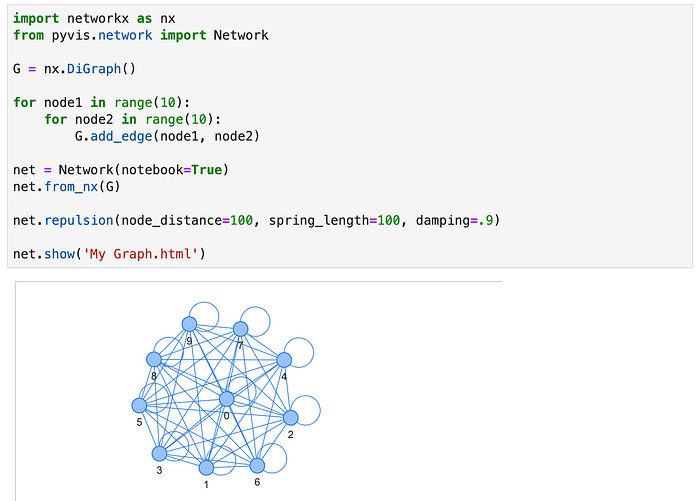
It has a number of useful settings, and it can be fun to just play with. I have to Khuyen Tran and this article for the excellent showcase of what this library can do.
https://towardsdatascience.com/pyvis-visualize-interactive-network-graphs-in-python-77e059791f01
Shap
I’ve had great results explaining machine learning models using Shap values.
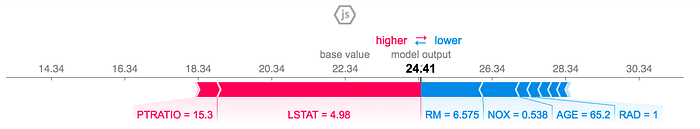
And more generally, I’ve found the SHAP plots to be an excellent way to understand the model myself.
Moreover, the properties of SHAP values allow many other applications, such as hyperparameter tuning & feature selection as shown here.
CatBoost
I see this as the definitive “have you tried…” tool to get highly performant regression and classification models.
- It implements almost every evaluation and loss metric I’ve needed.
- Easy to save & export
- Easy checkpointing, early stopping, etc…
- Overfitting detector
- In-built SHAP value calculation
- Handles categorical data without pre-processing
- Handles missing values
Huggingface
My go-to library for all things NLP these days.
https://towardsdatascience.com/7-models-on-huggingface-you-probably-didnt-knew-existed-f3d079a4fd7c
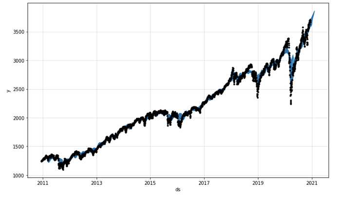
FB Prophet & Neural Prophet
FB Prophet has long been the benchmark for “quick” time series forecasting. FB has recently released Neural Prophet, and I look forward to testing it.
MissignNo
Ok, very simple library (and how could you not love the Pokemon reference). It gives you a view of the missing values on your tabular data.
import missingno as msgnmsgn.matrix(df)
https://github.com/ResidentMario/missingno
TensorFlow-Hub
I see no value in reinventing the wheel. I’ve had great results using TensorFlow Hub to load and use state-of-the-art models, mainly for preprocessing text, audio, and image data.
To give you a flavor, this is one way to get sentence embedding with a state of the art model:
import tensorflow_hub as hub

embed = hub.load("https://tfhub.dev/google/universal-sentence-encoder/4")embeddings = embed([
    "The quick brown fox jumps over the lazy dog.",
    "I am a sentence for which I would like to get its embedding"])

print(embeddings)
Just as easily we could look at using pre-trained models inside our own bespoke modeling:
url = "https://tfhub.dev/tensorflow/efficientnet/b0/feature-vector/1"model = tf.keras.Sequential([
    hub.KerasLayer(url, trainable=False),  # Can be True
    tf.keras.layers.Dense(num_classes, activation='softmax')
])
https://tfhub.dev/google/universal-sentence-encoder/4
https://tfhub.dev/tensorflow/efficientnet/b0/feature-vector/1
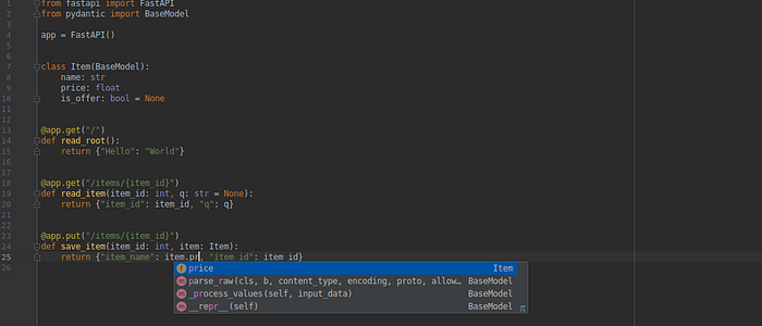
FastAPI
Like Flask, but sparks more joy.
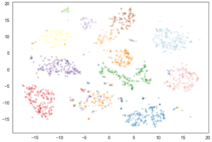
UMAP
Like t-SNE, but with a few more features. It is a very interesting dimensionality reduction method that has given me good results to visualize complex data.
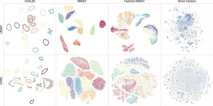
Highly recommend this explanation/introduction:
PaCMAP
PaCMAP seems to be an iteration of the graph-based dimensionality reduction techniques. Although it does not de-throne the likes of UMAP or t-SNE, the results you can achieve are remarkable.
See how PaCMAP can retain local and global structure as it projects this 3D mammoth to 2D.
As far as default settings go, it definitely beats UMAP on the Mammoth task:


https://github.com/YingfanWang/PaCMAP
https://towardsdatascience.com/why-you-should-not-rely-on-t-sne-umap-or-trimap-f8f5dc333e59
HDBSCAN
Like DBSCAN, but with regional estimates of density.
I came across HDBSCAN in this PyData talk — which I highly recommend:
https://hdbscan.readthedocs.io/en/latest/index.html
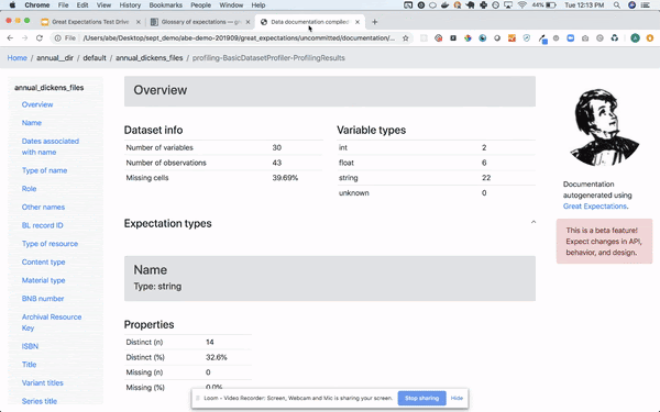
Great-Expectations
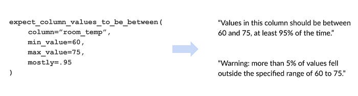
A great way to document and later validate your data assumptions.
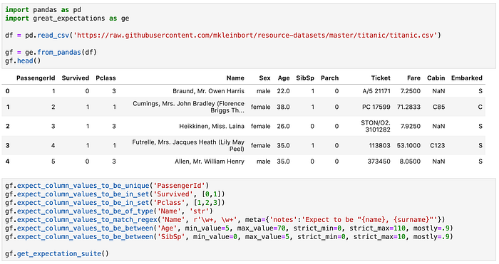
This gives you a JSON “suite” that you can run against new data.
I’d say the example above does not do ge justice, some of their 40+ expectation types are fairly powerful (and not the kind of thing you’d like to write yourself), such as:
- expect_column_bootstrapped_ks_test_p_value_to_be_greater_than
- expect_column_kl_divergence_to_be_less_than
- expect_column_median_to_be_between
- expect_column_pair_values_A_to_be_greater_than_B
- expect_column_proportion_of_unique_values_to_be_between
- expect_column_values_to_be_json_parseable
...
Moreover, there has been a lot of effort to move the computation to the data wherever possible (e.g. Spark / Postgress / BigQuery, …).
And there has been a lot of effort around self-writing documentation and automated profiling (though it’s still in the works)
It integrates nicely with pandas_profiling (if you are into that sort of thing)
Clize
A small library to turn python functions into command-line interfaces
from clize import rundef my_function(arg1, arg2, arg3):
    '''doc-string'''
    ...
    return ansif __name__ == "__main__":
    run(my_function) # Available as a CLI with --help
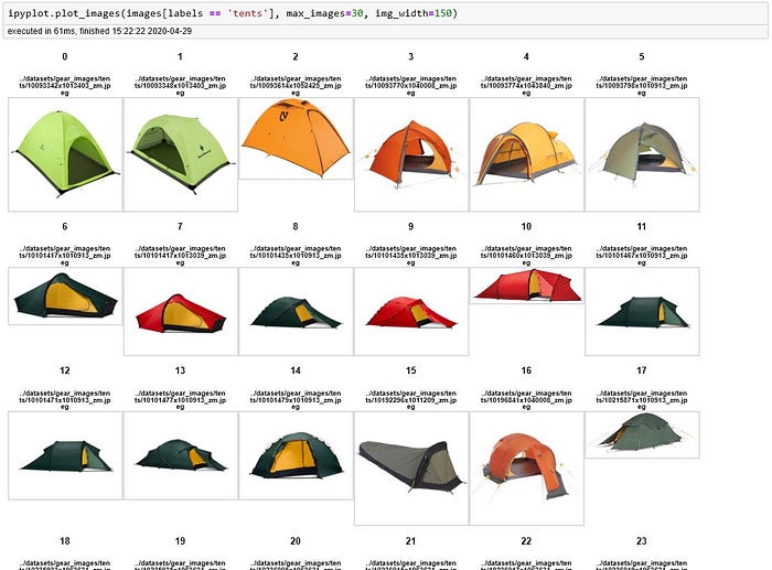
IPyplot
It’s good to enjoy the little things. And I’m not against adding one line to my requirements.txt for a few convenience tools.
I installed ipyplotto show PIL images in a grid. It does that well.
https://github.com/karolzak/ipyplot
Kedro
A very interesting approach to giving data science projects some structure. Admittedly it’s a rather rigid structure in my opinion but certainly has its benefits.
To be honest, the data catalog and visualization UI are its big selling points to me.
Swifter
A very simple way to sometimes make your pandas code much faster.
import pandas as pd
import numpy as np
import swifterdata = np.random.rand(100_000, 10).astype('str')df = pd.DataFrame(data)x1 = df.apply(lambda row: '-'.join(row), axis=1)
x2 = df.swifter.apply(lambda row: '-'.join(row), axis=1)
https://github.com/jmcarpenter2/swifter
Geopandas
Sometimes one has to do geospatial work, and this is the first library in my requirements.txtfile in those projects.
https://geopandas.org/index.html
Librosa
An almost all-in-one toolkit for audio processing. It is the one you’ll see in most tutorials.
FairML
A colleague of mine used this library to great results in one of our internal data science hackathons at Capgemini.
from fairml import audit_modelmodel = ...audit, _ = audit_model(model.predict, X_train)
https://github.com/adebayoj/fairml
(I should compare this to fairlear, aequitas, and aif360 at some point)
PyForest
I sometimes get tired of writing my usual imports.
import pandas as pd
import numpy as np
import matplotlib.pyplot as plt
import seaborn as sns
import plotly.express as px
import dask.dataframes as dd
...
To be honest, even writing that code sample felt a bit tiresome.
Pyforest is a simple library/jupyter extension that aims to get rid of this issue.

Pyforest automatically adds the import statements to your notebook WHEN you use the library. The experience is quite magical :)
https://github.com/8080labs/pyforest/
https://towardsdatascience.com/import-all-python-libraries-in-one-line-of-code-86e54f6f0108
LineProfiler
I suppose this is more a jupyter extension than anything else, but I have found it an amazing asset and teaching tool.
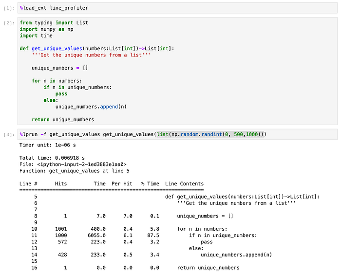
As you can see, that if n in unique_numbers check line #11 is responsible for 87.5% of our code runtime.
https://jakevdp.github.io/PythonDataScienceHandbook/01.07-timing-and-profiling.html
XArray
I have lost dozens of hours in this library. Do I love it? Do I hate it? Yes.
I am a firm believer that the right representation can make most problems much simpler, and by that token, I don’t always love expressing data as a 2d tables. Surely there is a way to encode higher dimensional structure? Surely there is a “pandas for tensors”…
Let me introduce:

I can best explain it as an n-dimensional generalization of the pandas dataframe.
Suppose you are doing some work for a retail chain, and you have some footfall, revenue, and staffing data for a few stores.

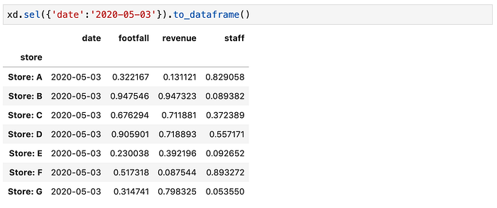
XArray has a novel way to group these datasets as three “slices” of (in this case) a 3d tensor.
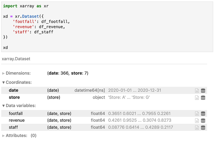
And from here you can start doing a lot of interesting work (most of which can then be cast back to pandas)
Be warned: it has a steep learning curve.
http://xarray.pydata.org/en/stable/
Numba
Another of those one-liners that might spark some joy. Just in time compiling for python code:
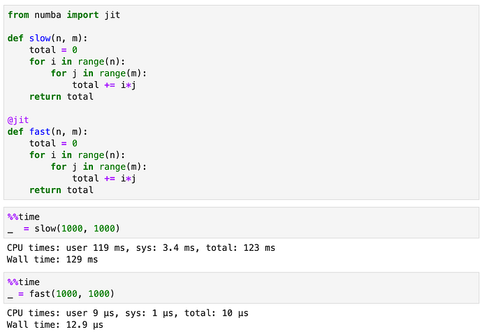
That is as easy as a 10,000x speed-up can be.
Salabim
Discrete event simulation in Python is not easy. That said, I have found the main event loop of Salabim fairly helpful.

I had a recent project where we were simulating a £1b+ supply chain in great detail. Our time step was 1h, our horizon was ~3years, and each step required ~4,000,000 updates.
We had to write some clever code to handle that number crunching, but at least Salabim made sure we were keeping to time.
https://www.salabim.org/manual/
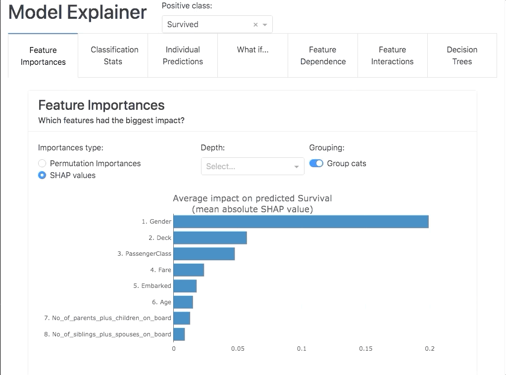
Explainer Dashboard
Model inspection, calibration, and testing are a constant across data science projects. This library seems to consolidate a lot of the tooling & statistics I look at to understand my models.
Honorable Mentions
Some tooling needs no introduction:
- Docker & Docker Compose
- Jupyter Lab
- ScikitLearn, Pandas, Numpy, Seaborn, Matplotlib
- Tensorflow, PyTorch
- OpenCV, PIL
- Dask
- Networkx
- Requests, Selenium
Libraries in my backlog
- Various AutoML libraries (Auto-ScikitLearn, FastAI, TPOT, PyCaret, FLAML)
- Various hyperparameter optimization tools (hyperopt, bayesian, optuna, ray)
- Experiment tracking (ML Flow, Weights&Biases)
- Various auto-EDA
- AutoNLP
- NotebookJS
- CausalForest from EconML
- FAISS for fast similarity search
- Category Encoders
- NGBoost
- Tensorflow Probability
- TensorFlow What-If
- Louvain for network data
- Implicit (recommended systems)
- Poetry for environment tracking
- ML-Extend
- Yellobricks
- Spacy (worked with it many times, but never in-depth)
- Modin (faster pandas?)
- PlaidML (deep learning on CPU)
- ML on streaming data with River
- Docly
- Haystack for document retrieval
- Various from here
- TabNet
- Clear.ML as an MLOps platform
- BentoML for its feedback features
- NumExpr
- Graphene
- NGrok or RemoteIt
- Featurewiz for feature selection
- PyHeat / Heartrate / Snoop [here]
- Pandas-to-SQL
- Imperio for better categorical encoding
- Cutecharts for XKCD style plots
- Pymotif for EDA on graphs
- SHAP-Hypertune for SHAP based hyperparameter tuning
- Imperio for additional transformers in scikit-learn pipelines.
- Prefect as an alternative to Airflow
- SDV for synthetic data generation
- Scikit-HTS for hierarchical time series
- Phik as a new and flexible correlation coefficient
- LinearDecisionTrees from as discussed here